本文翻译自:Demystifying responsive layout in Flutter,作者:Souvik Biswas,已获作者授权,译文首次发表于微信公众号「Meandni」,点击阅读。
Flutter 作为现如今应用如此广泛的跨平台开发框架,当然支持各种设备下屏幕的适配。
而当前,我们的应用也完全能运行在小如手表,大如电视的设备中,要实现这么多场景下的适配始终是一个挑战,但 Flutter 或许就能做到。
在 Flutter 中,设计响应式布局没有官方的硬性规定及标准。本文会向读者们展示设计自适应布局时可以遵循的一些方法。
Android
在介绍 Flutter 的屏幕适配方案之前,我想先简单说一下在原生 Android 和 iOS 下如何处理不同屏幕尺寸的布局,Android 主要有如下几种方式。
1. ConstraintLayout
ConstraintLayout (约束布局) 是 Android 支持的一种功能强大的布局组件,主要功能就是可以灵活地响应不同的手机屏幕尺寸,根据组件间的关系确定各个组件的位置和大小,这其实和 Flutter 内的布局约束概念有点类似。
详情可以参考 ConstraintLayout 官方文档:https://developer.android.com/training/constraint-layout?hl=zh-cn
但约束布局也不能解决多种设备的适配场景,因为它只能适应性的调整 UI 组件的大小,长宽,这么做其实并不优雅,而且在写运行在手表之类的屏幕很小的设备上,只调整大小也会使界面看起来给非常奇怪。
2. 替代布局
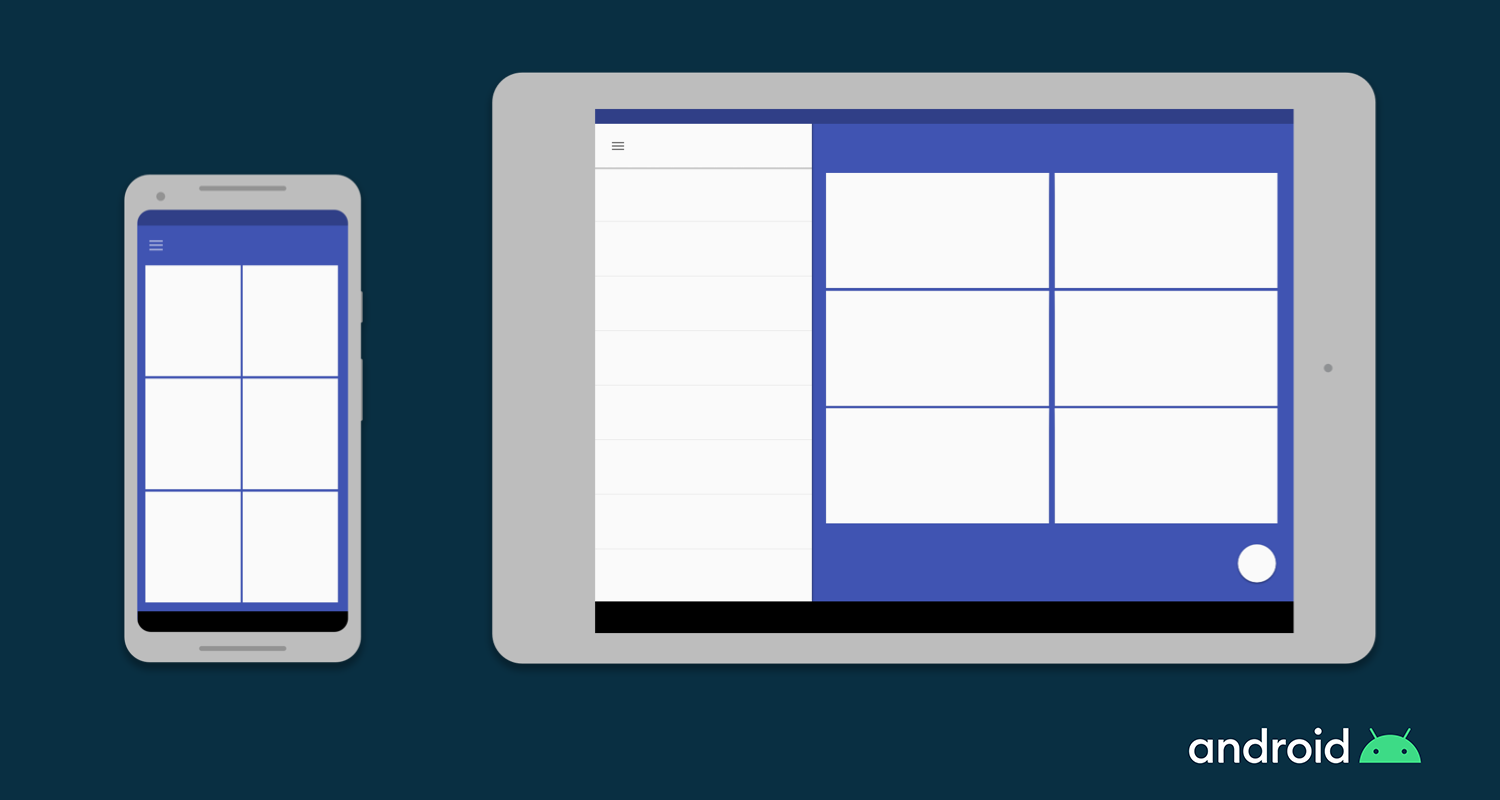
要解决上述问题,我们可以尝试针对不同大小的设备使用各不相同的布局文件。例如,可以在平板电脑等设备中实现左右视图分离,从而充分利用大屏幕下宽敞的屏幕宽度。
在 Android 中,开发者可以为不同的屏幕尺寸定义单独的布局文件,并且 Android 底层也会根据设备的屏幕尺寸自动处理这些布局之间的切换。
3. Fragment
合理使用 Fragment,我们可以将 UI 逻辑单独抽离到特定的 Fragment 中,这样在为大屏幕设备设计布局时就可以有效地复用这些逻辑了。
4. 矢量图
矢量图一般由 XML 创建,可以直接定义可配置的 Path 和颜色,相比像素位 bitmaps 更加灵活且高效,在不同尺寸的屏幕下也可以无限放大而不失真。Android 平台中,可以使用 VectorDrawable 类定义矢量图。
iOS
iOS 下,我们可以使用下面几种方式实现屏幕适配。
1. Auto Layout
Auto Layout 可以用来在 iOS 平台下构建可适配 UI,我们可以在其中定义控制应用程序内容的规则(或称为约束),当在处于某些条件(或者特征)时,Auto Layout 就会根据指定的约束条件自动重新调整布局。
2. Size 类
Size 类表示根据其大小自动分配给内容区域的特征。这种情况下,iOS 就可以根据内容区域的大小类别动态地进行布局调整。在 iPad 上,当应用处于 multitasking 的配置中运行时,Size 类同样适用。
3. UI 组件
在 iOS 上也原生提供了一些天然自适应的 UI 组件,如 UIStackView,UIViewController 和 UISplitViewController。
Flutter
即使我们不是 Android 或 iOS 开发人者,现在也应该大致熟悉了这两个平台如何处理自适应布局的一些方法了。
在 Android 中,要在单个屏幕上显示多个 UI 视图,建议使用 Fragment,它就相当于在 Activity 中可重用的组件。
在 Android 中,Activity 即代表一个页面,一个 Activity 中可以运行多个 Fragment,但同一个应用下,同时只展示一个 Activity。
在 iOS 中,要控制多个视图控制器(View Controllers),可以使用 UISplitViewController,它在分层界面中可以管理子视图控制器。
而 Flutter 中天然就存在 “一切皆为 Widget” 的概念,整个应用程序也基本都是由 Widget 组合而成的。并且每个 Widget 都是可以复用的,因此,想要在 Flutter 中实现屏幕自适应的布局,不需要学习其他任何概念,下面介绍的这些 Widget 应该足够你使用了!
Flutter 适配组件
如前所诉,在 Flutter 我们只需要掌握一些 Widget 即可,实际的开发过程中,我们也只需要在合适的地方使用它们即可。下面,我们就一起来看看这些组件分别有什么魔力。
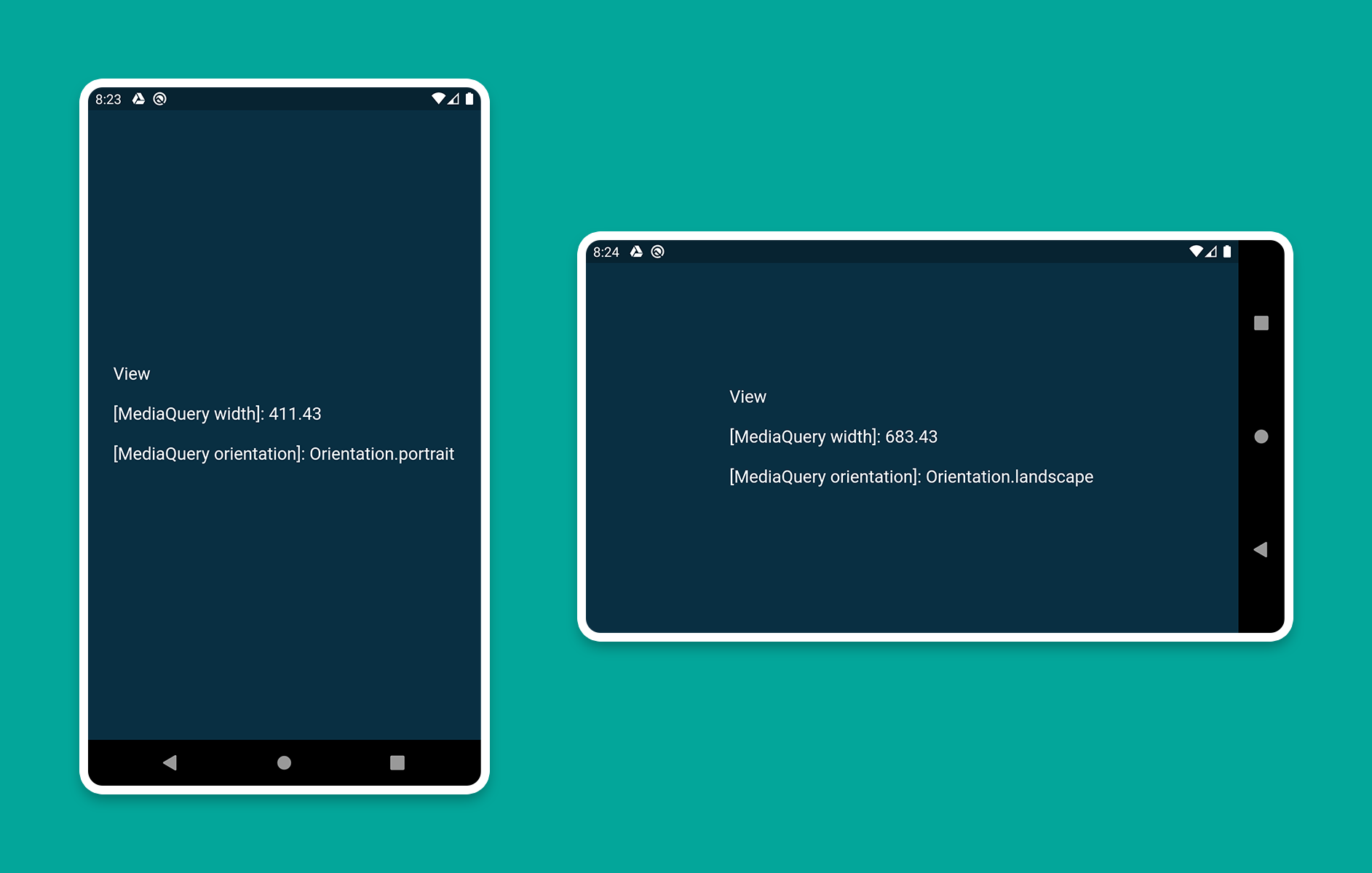
我要介绍的第一个 Widget 即是 MediaQuery,通过它可以直接获得屏幕的大小(宽度 / 高度)和方向(纵向 / 横向)。如下这个示例:
1
2
3
4
5
6
7
8
9
10
11
12
13
14
15
16
17
18
19
20
21
| class HomePage extends StatelessWidget {
@override
Widget build(BuildContext context) {
Size screenSize = MediaQuery.of(context).size;
Orientation orientation = MediaQuery.of(context).orientation;
return Scaffold(
body: Container(
color: CustomColors.android,
child: Center(
child: Text(
'View\n\n' +
'[MediaQuery width]: ${screenSize.width.toStringAsFixed(2)}\n\n' +
'[MediaQuery orientation]: $orientation',
style: TextStyle(color: Colors.white, fontSize: 18),
),
),
),
);
}
}
|
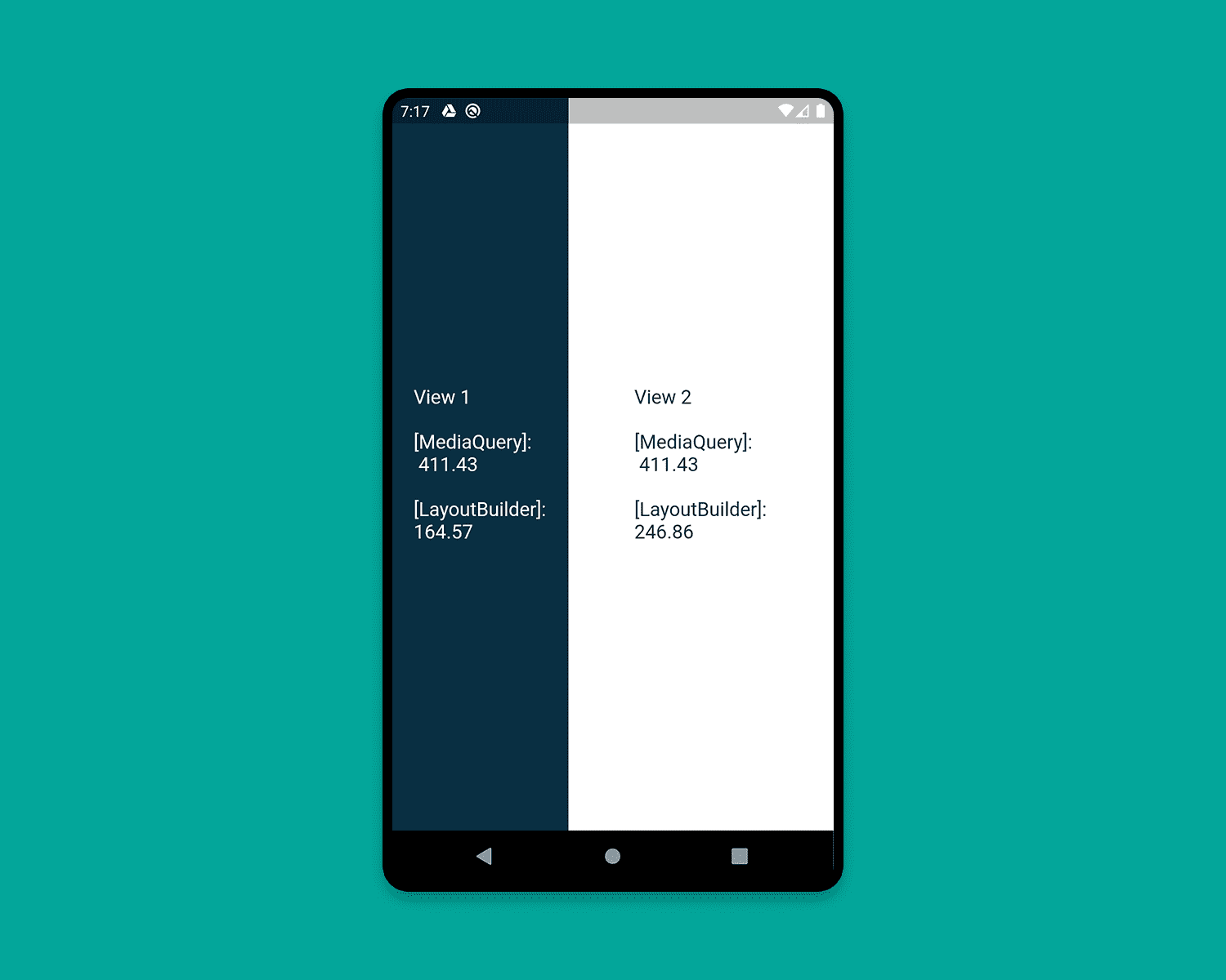
2. LayoutBuilder
使用 LayoutBuilder 组件,可以获得一个 BoxConstraints 对象,通过该对象我们就可以拿到 Widget 的 maxWidth(最大宽度) 和 maxHeight(最大高度)
MediaQuery 和 LayoutBuilder 的区别在在于,MediaQuery 得到的是整个屏幕的宽高,而 LayoutBuilder 得到的是特定组件的最大高度和宽度。
如下这个示例:
1
2
3
4
5
6
7
8
9
10
11
12
13
14
15
16
17
18
19
20
21
22
23
24
25
26
27
28
29
30
31
32
33
34
35
36
37
38
39
40
41
42
43
44
45
| class HomePage extends StatelessWidget {
@override
Widget build(BuildContext context) {
Size screenSize = MediaQuery.of(context).size;
return Scaffold(
body: Row(
children: [
Expanded(
flex: 2,
child: LayoutBuilder(
builder: (context, constraints) => Container(
color: CustomColors.android,
child: Center(
child: Text(
'View 1\n\n' +
'[MediaQuery]:\n ${screenSize.width.toStringAsFixed(2)}\n\n' +
'[LayoutBuilder]:\n${constraints.maxWidth.toStringAsFixed(2)}',
style: TextStyle(color: Colors.white, fontSize: 18),
),
),
),
),
),
Expanded(
flex: 3,
child: LayoutBuilder(
builder: (context, constraints) => Container(
color: Colors.white,
child: Center(
child: Text(
'View 2\n\n' +
'[MediaQuery]:\n ${screenSize.width.toStringAsFixed(2)}\n\n' +
'[LayoutBuilder]:\n${constraints.maxWidth.toStringAsFixed(2)}',
style: TextStyle(color: CustomColors.android, fontSize: 18),
),
),
),
),
),
],
),
);
}
}
|
3. OrientationBuilder
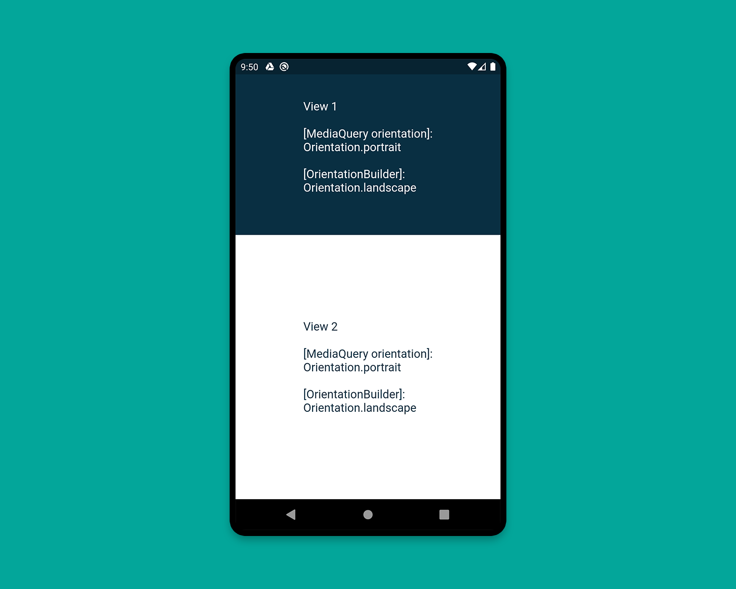
要确定当前 Widget 的方向,可以使用 OrientationBuilder 组件。这里的方向与 MediaQuery 提供的设备方向不同。如下这个示例:
1
2
3
4
5
6
7
8
9
10
11
12
13
14
15
16
17
18
19
20
21
22
23
24
25
26
27
28
29
30
31
32
33
34
35
36
37
38
39
40
41
42
43
44
45
| class HomePage extends StatelessWidget {
@override
Widget build(BuildContext context) {
Orientation deviceOrientation = MediaQuery.of(context).orientation;
return Scaffold(
body: Column(
children: [
Expanded(
flex: 2,
child: Container(
color: CustomColors.android,
child: OrientationBuilder(
builder: (context, orientation) => Center(
child: Text(
'View 1\n\n' +
'[MediaQuery orientation]:\n$deviceOrientation\n\n' +
'[OrientationBuilder]:\n$orientation',
style: TextStyle(color: Colors.white, fontSize: 18),
),
),
),
),
),
Expanded(
flex: 3,
child: OrientationBuilder(
builder: (context, orientation) => Container(
color: Colors.white,
child: Center(
child: Text(
'View 2\n\n' +
'[MediaQuery orientation]:\n$deviceOrientation\n\n' +
'[OrientationBuilder]:\n$orientation',
style: TextStyle(color: CustomColors.android, fontSize: 18),
),
),
),
),
),
],
),
);
}
}
|
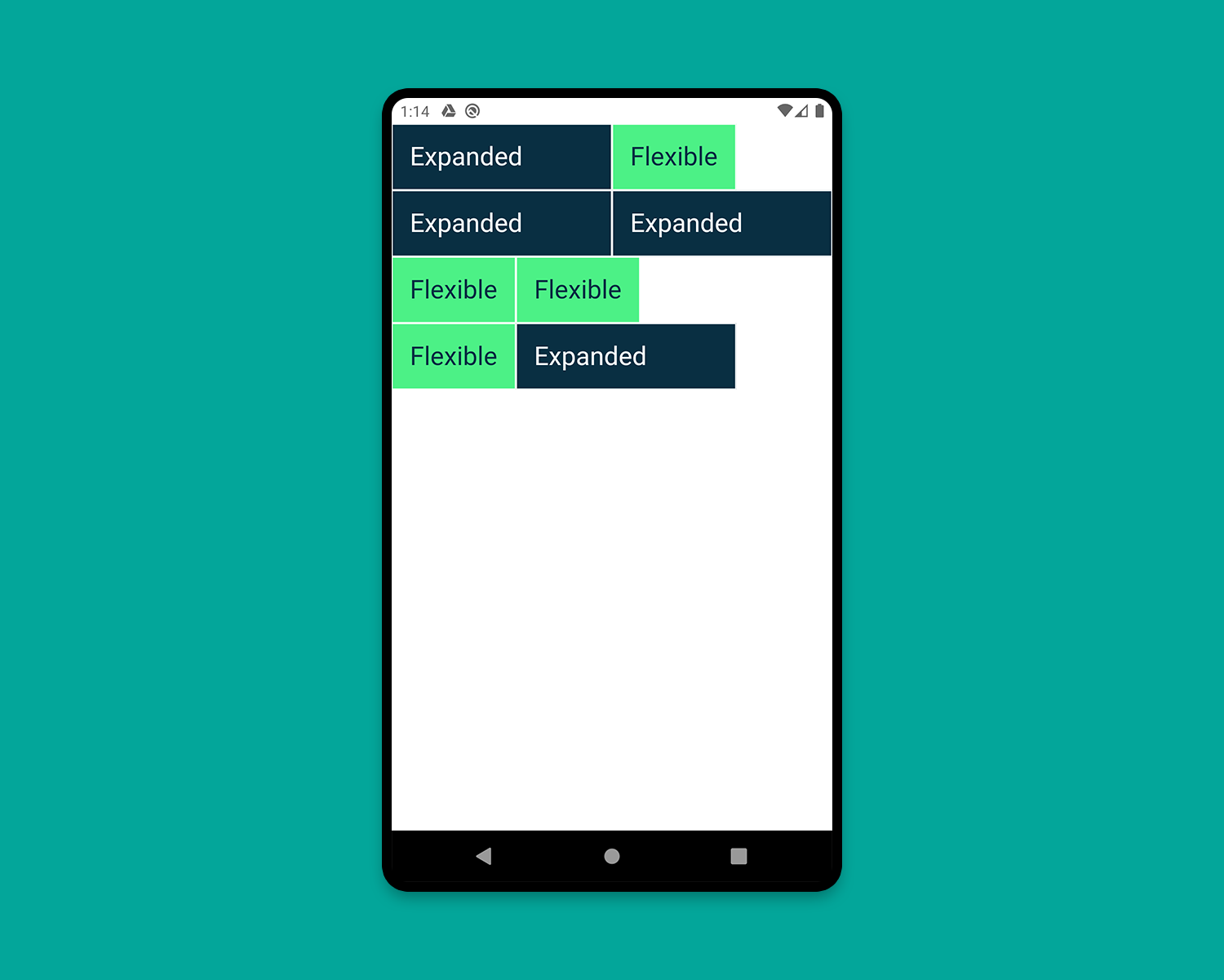
4. Expanded 和 Flexible
Expanded 和 Flexible 这两个组件可以和 Column/Row 搭配使用,来实现非常完美的自适应效果。 Expanded 可以用来拓展 Row, 、Column 和 Flex,从而让子组件填充可用空间,Flexible 功能类似但并不一定能填充全部可用空间。
下面这个例子演示了混合使用 Expanded 和 Flexible 的各种方式:
1
2
3
4
5
6
7
8
9
10
11
12
13
14
15
16
17
18
19
20
21
22
23
24
25
26
27
28
29
30
31
32
33
34
35
36
37
38
39
40
41
42
43
44
45
46
47
48
49
50
51
52
53
54
55
56
57
58
59
60
61
62
63
64
65
66
67
68
69
70
71
72
73
74
75
76
77
78
79
80
| class HomePage extends StatelessWidget {
@override
Widget build(BuildContext context) {
return Scaffold(
backgroundColor: Colors.white,
body: SafeArea(
child: Column(
children: [
Row(
children: [
ExpandedWidget(),
FlexibleWidget(),
],
),
Row(
children: [
ExpandedWidget(),
ExpandedWidget(),
],
),
Row(
children: [
FlexibleWidget(),
FlexibleWidget(),
],
),
Row(
children: [
FlexibleWidget(),
ExpandedWidget(),
],
),
],
),
),
);
}
}
class ExpandedWidget extends StatelessWidget {
@override
Widget build(BuildContext context) {
return Expanded(
child: Container(
decoration: BoxDecoration(
color: CustomColors.android,
border: Border.all(color: Colors.white),
),
child: Padding(
padding: const EdgeInsets.all(16.0),
child: Text(
'Expanded',
style: TextStyle(color: Colors.white, fontSize: 24),
),
),
),
);
}
}
class FlexibleWidget extends StatelessWidget {
@override
Widget build(BuildContext context) {
return Flexible(
child: Container(
decoration: BoxDecoration(
color: CustomColors.androidAccent,
border: Border.all(color: Colors.white),
),
child: Padding(
padding: const EdgeInsets.all(16.0),
child: Text(
'Flexible',
style: TextStyle(color: CustomColors.android, fontSize: 24),
),
),
),
);
}
}
|
5. FractionallySizedBox
FractionallySizedBox 组件可以使子组件填充部分可用空间,该特性在 Expanded 或 Flexible 中特别有用。示例如下:
1
2
3
4
5
6
7
8
9
10
11
12
13
14
15
16
17
18
19
20
21
22
23
24
25
26
27
28
29
30
31
32
33
34
35
36
37
38
39
40
41
42
43
44
45
46
47
48
49
50
51
52
53
54
55
56
57
58
59
60
61
62
63
64
65
66
67
| class HomePage extends StatelessWidget {
@override
Widget build(BuildContext context) {
return Scaffold(
backgroundColor: Colors.white,
body: SafeArea(
child: Column(
mainAxisAlignment: MainAxisAlignment.start,
children: [
Row(
crossAxisAlignment: CrossAxisAlignment.start,
children: [
FractionallySizedWidget(widthFactor: 0.4),
],
),
Row(
crossAxisAlignment: CrossAxisAlignment.start,
children: [
FractionallySizedWidget(widthFactor: 0.6),
],
),
Row(
crossAxisAlignment: CrossAxisAlignment.start,
children: [
FractionallySizedWidget(widthFactor: 0.8),
],
),
Row(
crossAxisAlignment: CrossAxisAlignment.start,
children: [
FractionallySizedWidget(widthFactor: 1.0),
],
),
],
),
),
);
}
}
class FractionallySizedWidget extends StatelessWidget {
final double widthFactor;
FractionallySizedWidget({@required this.widthFactor});
@override
Widget build(BuildContext context) {
return Expanded(
child: FractionallySizedBox(
alignment: Alignment.centerLeft,
widthFactor: widthFactor,
child: Container(
decoration: BoxDecoration(
color: CustomColors.android,
border: Border.all(color: Colors.white),
),
child: Padding(
padding: const EdgeInsets.all(16.0),
child: Text(
'${widthFactor * 100}%',
style: TextStyle(color: Colors.white, fontSize: 24),
),
),
),
),
);
}
}
|
6. AspectRatio
AspectRatio 组件可以直接指定子组件的固定宽高比例,使用时,我们可以使用布局约束的最大宽度,并给定一个宽高比自适应其高度,如下示例:
1
2
3
4
5
6
7
8
9
10
11
12
13
14
15
16
17
18
19
20
21
22
23
24
25
26
27
28
29
30
31
32
33
34
35
36
37
38
39
40
41
42
43
44
| class HomePage extends StatelessWidget {
@override
Widget build(BuildContext context) {
return Scaffold(
backgroundColor: Colors.white,
body: SafeArea(
child: Column(
children: [
AspectRatioWidget(ratio: '16 / 9'),
AspectRatioWidget(ratio: '3 / 2'),
],
),
),
);
}
}
class AspectRatioWidget extends StatelessWidget {
final String ratio;
AspectRatioWidget({@required this.ratio});
@override
Widget build(BuildContext context) {
return AspectRatio(
aspectRatio: Fraction.fromString(ratio).toDouble(),
child: Container(
decoration: BoxDecoration(
color: CustomColors.android,
border: Border.all(color: Colors.white),
),
child: Padding(
padding: const EdgeInsets.all(16.0),
child: Center(
child: Text(
'AspectRatio - $ratio',
style: TextStyle(color: Colors.white, fontSize: 24),
),
),
),
),
);
}
}
|
下面,我们就可以利用上面介绍的组件实现一个实际的应用了。
应用开发实践
在这个过程中,即可实现 Flutter 中的视图分离,如下示例图所示,我们要开发的应用名为 Flow ,是一款聊天应用。
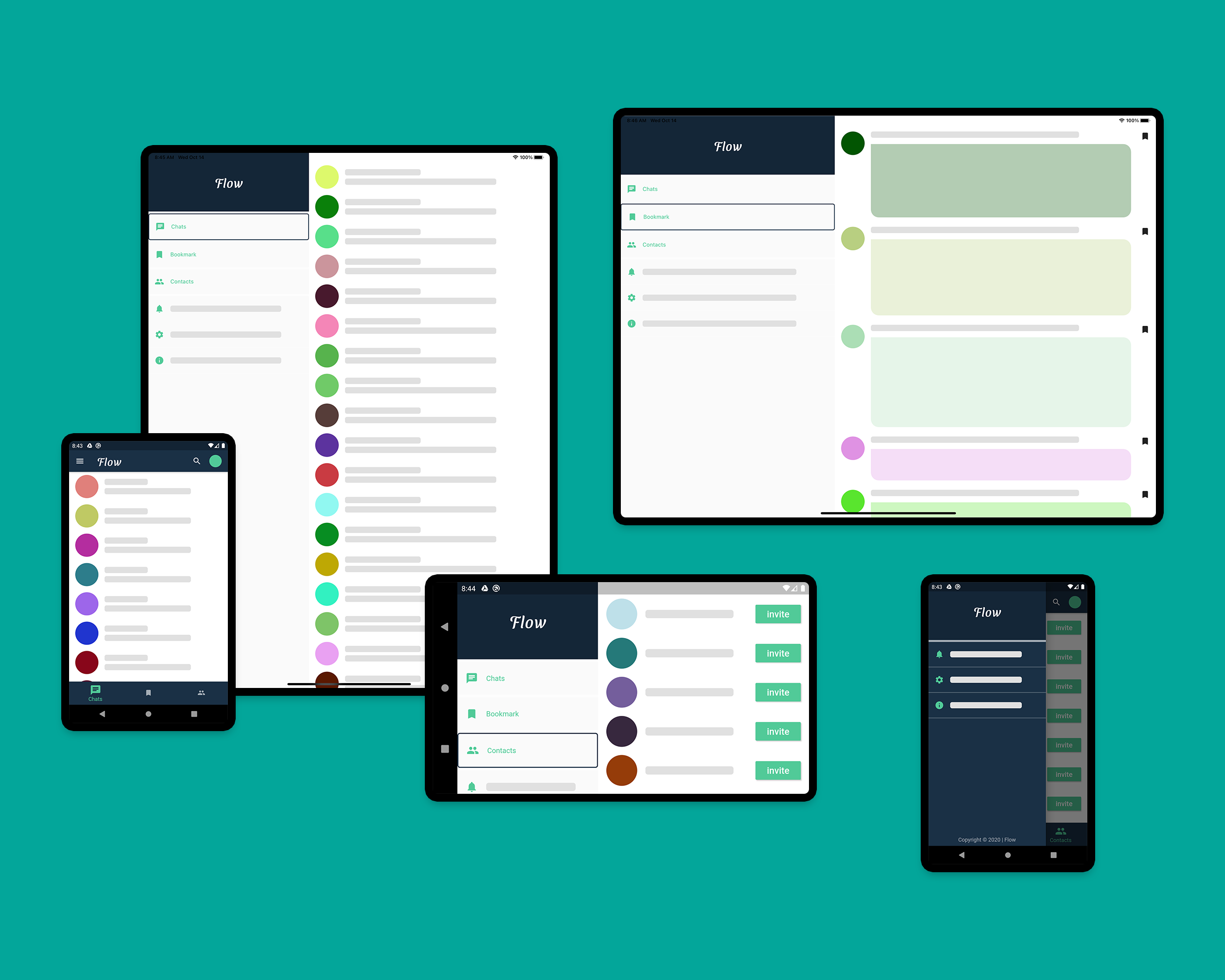
Flow 主要包括如下两个页面:
- 首页(
PeopleView,BookmarkView,ContactView)
- 聊天页面(
PeopleView,ChatView)
主页
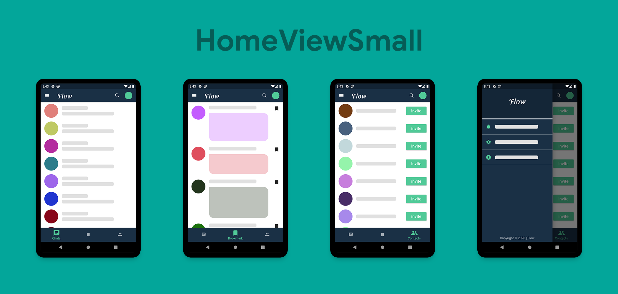
应用启动时,首页展示 HomePage,该 Widget 主要有如下两个视图:
- HomeViewSmall(包括
AppBar,Drawer,BottomNavigationBar 和 DestinationView)
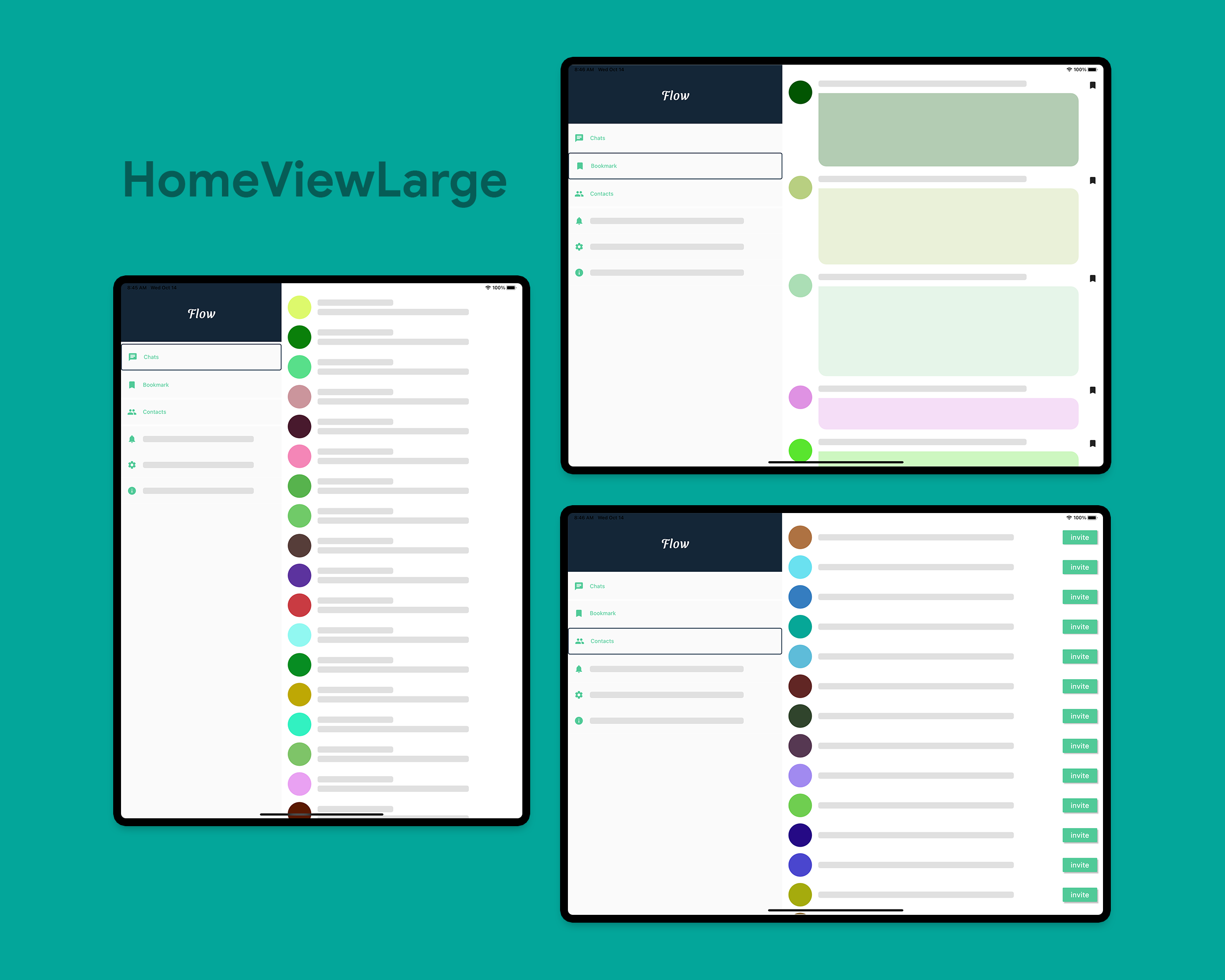
- HomeViewLarge(由拆分视图组组成,
MenuWidget &DestinationView)
1
2
3
4
5
6
7
8
9
10
11
12
13
14
15
16
17
18
| class _HomePageState extends State<HomePage> {
int _currentIndex = 0;
@override
Widget build(BuildContext context) {
return Scaffold(
body: LayoutBuilder(
builder: (context, constraints) {
if (constraints.maxWidth < 600) {
return HomeViewSmall();
} else {
return HomeViewLarge();
}
},
),
);
}
}
|
这里,使用 LayoutBuilder 得到了组件的 maxWidth ,并通过该值在页面中展示两个不同的组件,HomeViewSmall 和 HomeViewLarge。
1
2
3
4
5
6
7
8
9
10
11
12
13
14
15
16
17
18
19
20
21
22
23
24
| class _HomeViewSmallState extends State<HomeViewSmall> {
int _currentIndex = 0;
@override
Widget build(BuildContext context) {
return Scaffold(
appBar: AppBar(
),
drawer: Drawer(
),
bottomNavigationBar: BottomNavigationBar(
),
body: IndexedStack(
index: _currentIndex,
children: allDestinations.map<Widget>((Destination destination) {
return DestinationView(destination);
}).toList(),
),
);
}
}
|
IndexedStack 和 DestinationView 两个组件主要用来根据用户点击 BottomNavigationBar 做页面切换的动作。
1
2
3
4
5
6
7
8
9
10
11
12
13
14
15
16
17
18
19
20
21
22
23
24
25
26
27
28
29
30
31
32
33
34
35
| class _HomeViewLargeState extends State<HomeViewLarge> {
int _index = 0;
@override
Widget build(BuildContext context) {
return Container(
child: Row(
crossAxisAlignment: CrossAxisAlignment.start,
mainAxisAlignment: MainAxisAlignment.start,
children: [
Expanded(
flex: 2,
child: MenuWidget(
selectedIndex: _index,
onTapped: (selectedIndex) {
setState(() {
_index = selectedIndex;
});
},
),
),
Expanded(
flex: 3,
child: IndexedStack(
index: _index,
children: allDestinations.map<Widget>((Destination destination) {
return DestinationView(destination);
}).toList(),
),
),
],
),
);
}
}
|
对于大屏幕,应用可以展示包含 MenuWidget 和 DestinationView 两个组件的拆分视图。在 Flutter 中,实现拆分视图特别简单,只需要并排将组件放入 Row 中即可,如果需要填充剩余控件,可以使用 Expanded 包裹这两个组件,我们可以通过指定 Expanded 的 flex 属性分别设置两个组件所占比例(flex 属性默认为 1,即两个组件各一半),上面代码设置比例为 1:3。
当然,如果此时你打开其他页面,然后返回,页面原有状态将会丢失,也就是说始终返回默认展示的页面,即 Chats,要解决此问题,可以使用回调函数指定页面返回至 HomePage,当然,最好可以使用合适的状态管理方案,因为本文主要目的是构建响应式布局,这里我们暂且不设计状态管里的延伸,我们可以做下面这些修改。
修改 HomeViewSmall:
1
2
3
4
5
6
7
8
9
10
11
12
13
14
15
16
17
18
19
20
21
22
23
24
25
26
27
28
29
30
31
32
33
34
35
36
37
38
39
40
41
42
43
| class HomeViewSmall extends StatefulWidget {
final int currentIndex;
final Function(int selectedIndex) onTapped;
HomeViewSmall(this.currentIndex, this.onTapped);
@override
_HomeViewSmallState createState() => _HomeViewSmallState();
}
class _HomeViewSmallState extends State<HomeViewSmall> {
int _currentIndex = 0;
@override
void initState() {
super.initState();
_currentIndex = widget.currentIndex;
}
@override
Widget build(BuildContext context) {
return Scaffold(
bottomNavigationBar: BottomNavigationBar(
currentIndex: _currentIndex,
onTap: (int index) {
setState(() {
_currentIndex = index;
widget.onTapped(_currentIndex);
});
},
items: allDestinations.map((Destination destination) {
return BottomNavigationBarItem(
icon: Icon(destination.icon),
label: destination.title,
);
}).toList(),
),
);
}
}
|
修改 HomeViewLarge:
1
2
3
4
5
6
7
8
9
10
11
12
13
14
15
16
17
18
19
20
21
22
23
24
25
26
27
28
29
30
31
32
33
34
35
36
37
38
39
40
41
42
43
44
45
| class HomeViewLarge extends StatefulWidget {
final int currentIndex;
final Function(int selectedIndex) onTapped;
HomeViewLarge(this.currentIndex, this.onTapped);
@override
_HomeViewLargeState createState() => _HomeViewLargeState();
}
class _HomeViewLargeState extends State<HomeViewLarge> {
int _index = 0;
@override
void initState() {
super.initState();
_index = widget.currentIndex;
}
@override
Widget build(BuildContext context) {
return Container(
child: Row(
crossAxisAlignment: CrossAxisAlignment.start,
mainAxisAlignment: MainAxisAlignment.start,
children: [
Expanded(
flex: 2,
child: MenuWidget(
selectedIndex: _index,
onTapped: (selectedIndex) {
setState(() {
_index = selectedIndex;
widget.onTapped(_index);
});
},
),
),
],
),
);
}
}
|
修改 HomePage:
1
2
3
4
5
6
7
8
9
10
11
12
13
14
15
16
17
18
19
20
21
22
23
24
25
26
27
28
29
30
31
| class HomePage extends StatefulWidget {
@override
_HomePageState createState() => _HomePageState();
}
class _HomePageState extends State<HomePage> {
int _currentIndex = 0;
@override
Widget build(BuildContext context) {
return Scaffold(
body: LayoutBuilder(
builder: (context, constraints) {
if (constraints.maxWidth < 600) {
return HomeViewSmall(_currentIndex, (index) {
setState(() {
_currentIndex = index;
});
});
} else {
return HomeViewLarge(_currentIndex, (index) {
setState(() {
_currentIndex = index;
});
});
}
},
),
);
}
}
|
现在,可适应组件 HomePage 就已完成。
聊天页面
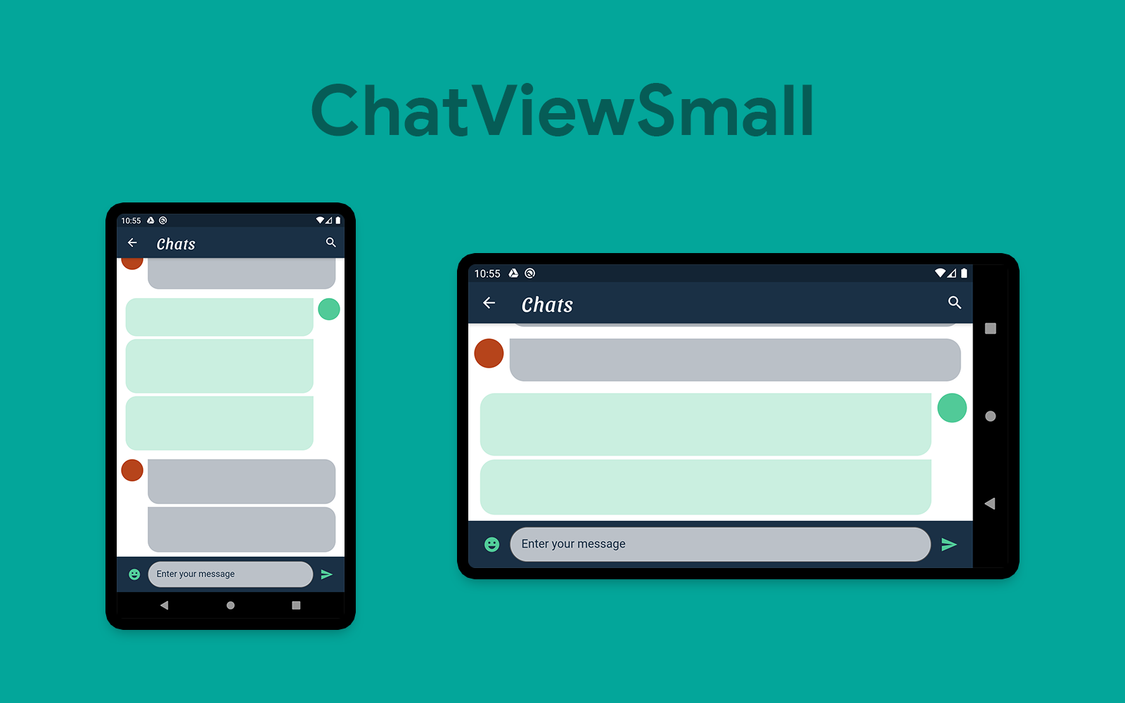
ChatPage 与 HomePage 类似,包含如下两个组件:
- ChatViewSmall(由
AppBar,ChatList&SendWidget 组成)
- ChatViewLarge(由
PeopleView,ChatList&SendWidget 组成)
1
2
3
4
5
6
7
8
9
10
11
12
13
14
15
16
17
18
19
20
21
22
23
| class ChatPage extends StatelessWidget {
final Color profileIconColor;
ChatPage(this.profileIconColor);
@override
Widget build(BuildContext context) {
return Scaffold(
body: OrientationBuilder(
builder: (context, orientation) => LayoutBuilder(
builder: (context, constraints) {
double breakpointWidth = orientation == Orientation.portrait ? 600 : 800;
if (constraints.maxWidth < breakpointWidth) {
return ChatViewSmall(profileIconColor);
} else {
return ChatViewLarge(profileIconColor);
}
},
),
),
);
}
}
|
这里,我们使用了 OrientationBuilder 搭配 LayoutBuilder,breakpointWidth 适应当前方向的更改,此时, PeopleView 在小屏幕设备下不展示,如下代码:
1
2
3
4
5
6
7
8
9
10
11
12
13
14
15
16
17
18
19
20
21
| class ChatViewSmall extends StatelessWidget {
final Color profileIconColor;
ChatViewSmall(this.profileIconColor);
@override
Widget build(BuildContext context) {
return Scaffold(
appBar: AppBar(
),
body: Container(
color: Colors.white,
child: Column(
children: [
Expanded(child: ChatList(profileIconColor)),
SendWidget(),
],
),
),
);
}
}
|
1
2
3
4
5
6
7
8
9
10
11
12
13
14
15
16
17
18
19
20
21
22
23
24
25
26
27
28
29
30
31
32
| class ChatViewLarge extends StatelessWidget {
final Color profileIconColor;
ChatViewLarge(this.profileIconColor);
@override
Widget build(BuildContext context) {
return Container(
child: Row(
children: [
Expanded(
flex: 2,
child: SingleChildScrollView(
child: PeopleView(),
),
),
Expanded(
flex: 3,
child: Container(
color: Colors.white,
child: Column(
children: [
Expanded(child: ChatList(profileIconColor)),
SendWidget(),
],
),
),
),
],
),
);
}
}
|
下一步
我们已经使用 Flutter 成功开发出了一个具有屏幕适配功能的应用了,读者们也可以在此基础上继续完善,例如定义根据屏幕尺寸适配不同的 fontsize 等等。所有示例代码:https://github.com/sbis04/responsive_design,
关注公众号「Meandni」,及时阅读最新前沿技术动态,不至于落后时代。
